INDORAMA
OBJECTIVE
Indorama Corporation is one of Asia’s leading chemical companies, its origins trace back to 1975 with the start of Indorama Synthetics in Indonesia.
Today, Indorama Corporation, which is headquartered in Singapore, manufactures a multitude of products including fertilizers, polyethylene, polypropylene, polyester, textiles, cotton fibre, and medical gloves. We are the largest producer of urea and phosphate fertilizers in Sub-Saharan Africa, the largest producer of polyolefins in West Africa, and the third largest producer of synthetic gloves in the world. Indorama is also an integrated producer of cotton and synthetic spun yarns.
Due to the size and complexity of the project which, in addition to the main company, involved 11 associates, it was decided to divide the process into 3 phases. The first phase concerned the brand identity, restyling of the logo, stationary and marketing collaterals. The second phase concerned the packaging of all products with the challenge of being compliant with local legal restrictions. The third phase, still in process, is the digital revolution, which concerns the reconstruction from scratch of the corporate website and of all those of the associated companies with the addition of the apps used in some countries such as Nigeria, India and Brazil.
THE CHALLENGE
Due to the size and complexity of the project which, in addition to the main company, involved 11 associates, it was decided to divide the process into 3 phases. The first phase concerned the brand identity, restyling of the logo, stationary and marketing collaterals. The second phase concerned the packaging of all products with the challenge of being compliant with local legal restrictions. The third phase, still in process, is the digital revolution, which concerns the reconstruction from scratch of the corporate website and of all those of the associated companies with the addition of the apps used in some countries such as Nigeria, India and Brazil.
MY ROLE
As a Lead Designer I managed all aspects of the design process, from research and ideation, to creative conceptualisation and design.
TOOLS
- Indesign, Illustrator, Photoshop, PowerPoint, Figma
PHASE 1 - REBRANDING
First of all, it was important for the designer to study the conditions and philosophy of existing logo functionality, details about company activities and business goals and customers’ wishes about the redesign process. For main company logo, we applied the changes carefully and gradually, with minor alterations eliminating the risk of losing recognition on the market.
The logo has been treated with respect to the company’s history and philosophy as well as the brand image has grown through the years. Therefore, the new design had to take its roots from the existing branding, but offer some refreshment and add some trends to adapt to modern digital media.
BEFORE

AFTER

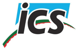
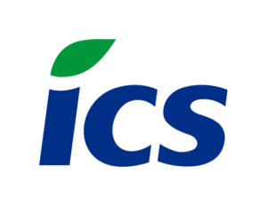
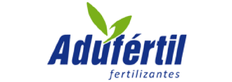
An opposite approach was taken for other associates where we decided upon a fully new design with nothing in common with the current branding. Some examples below.
BEFORE
AFTER
BEFORE
AFTER
Marketing collaterals
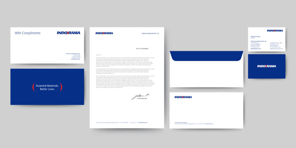
All marketing collaterals have been redesigned to better reflect the new brand identity. For a comprehensive overview of the changes, please refer to the updated brand guidelines.
PHASE 2 - PAckaging
This phase marks a significant step forward for Indorama. We embarked on a bold rebranding initiative for the packaging, aiming to embody our unwavering commitment to sustainability and environmental responsibility.
While I provided strategic art direction, the project itself was masterfully crafted by a renowned design agency known for its innovative and impactful work.
Through close collaboration, we brought this vision to life. The creative process encompassed several key elements:
- Strategic Logo Placement: We re-positioned the Indorama logo to create a more prominent and impactful brand presence on our packaging.
- Cohesive Color Palette: Replacing the vibrant multi-colored scheme, we embraced a sophisticated palette inspired by the solidity of blue, symbolizing our unwavering commitment to quality, and the energy of red, representing our passion for innovation and progress.
- Consistent Iconography: A unique set of icons was developed to visually communicate the key benefits of our products, including their sustainable and environmentally friendly features. These icons ensure brand consistency across regions and languages.
- Global Packaging Design: We created a unified packaging design system that seamlessly adapts to different product lines and regulations across various countries. This ensures brand recognition and consumer trust regardless of location.
Beyond aesthetics, this rebranding initiative reflects the core values that drive Indorama’s success. We strive to be the material company of choice for our customers by delivering innovative, high-performance solutions that prioritize environmental responsibility and contribute to a more sustainable future.
PHASE 3 - DIGITAL ASSETS
THE CHALLENGE
Since its inception almost 50 years ago, Indorama has built its legacy on pushing the boundaries of essential materials, whether in chemicals, textiles, fertilizers, or real estate. The mission has always been to redefine industry standards through customer-centric innovation, making them the material company of choice.
The website didn’t reflect this dynamic. Aesthetically it was a visual dumping ground which didn’t do justice to the brand purpose.
There was no structure to the content. It amplified confusion rather than coherency.
We needed to create a system that could logically represent the wide breadth of content they started producing. Also, it was important to come up with a modern and appealing visual style that would shine a light on the brand’s personality. Make it easy to understand the company value and facilitate positive user experience through informative and relevant content to navigate potential clients in the right direction.
Discovery phase
The journey began by diving deep into both internal (company) and external (user) drivers. We wanted to understand the true essence of the proposed solution, how it should function, not just how it should look. Our process unfolded in five key steps:
1. Refining Business Requirements
First, we held workshops with key stakeholders to uncover the:
Brand vision: the company’s aspirations and identity
Overall goals: what they ultimately wanted to achieve
Challenges: roadblocks hindering their success
We delved into both internal aspects like business needs and limitations, and external factors like competitive landscapes and best practices. Documenting these insights became our guiding star, ensuring shared understanding and alignment throughout the project.
2. Site and Content Audit
A seamless user experience hinges on anticipating their needs at every step. We identified various user types and charted their journeys through the website. This informed the site structure, allowing us to streamline user flows by removing unnecessary pages, merging existing ones, and adding new ones where needed.
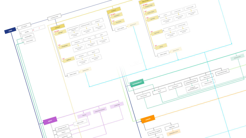
3. Context Exploration
With the website’s purpose solidified, we needed a system to present diverse content. Inspiration struck from some of the most profitable competitors, influencing how we would categorise and deliver information.
4. Modular System
Recognizing the need for a flexible system, we crafted individual content elements, each adhering to the same logic and style. These modular pieces, with varying hierarchies and layouts, formed the building blocks of the entire website.
5. Wireframes
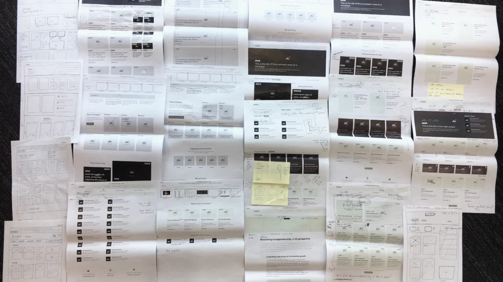
With the groundwork laid, we turned to wireframes, crafting the core desktop experience. Knowing the “why” and “what” made constructing pages a breeze. Feedback iterations were easy, devoid of design ego clinging to aesthetics. Ultimately, each page focused on conveying its purpose and addressing user concerns, with logical information structures for quick scanning.
DelIVERY PHASE
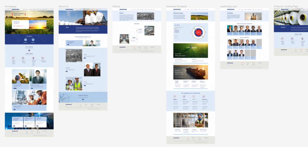
With the bedrock of logic and functionality laid, the visual design process was all about aesthetics and quality.
Low-fidelity prototype map out the UI’s core structure and user flow, ensuring a smooth and intuitive experience.
Using a pre-defined library of UI components, the interface was assembled. This system ensured consistency and efficiency, while still allowing for creative expression.
For the developments, a comprehensive toolkit was crafted. This includes detailed style guides, usage guidelines, and recommendations, all meticulously documented.
A high-fidelity prototype showcasing realistic interactions and animations was created to test the product in the real world.
After each stage, we conduct rigorous testing sessions. From user interviews to usability studies, we gather feedback and iterate on our designs.
By embracing this meticulous yet creative process, we transform logic and functionality into a UI that’s not just beautiful, but also a joy to use.
